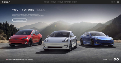
Review of the existing solution
In order to understand the meaning behind the message ‘Your Future Tesla’ people need to watch the video. The video demonstrates all the beauty of Tesla cars and reminds users of 3 models they might consider in the future.
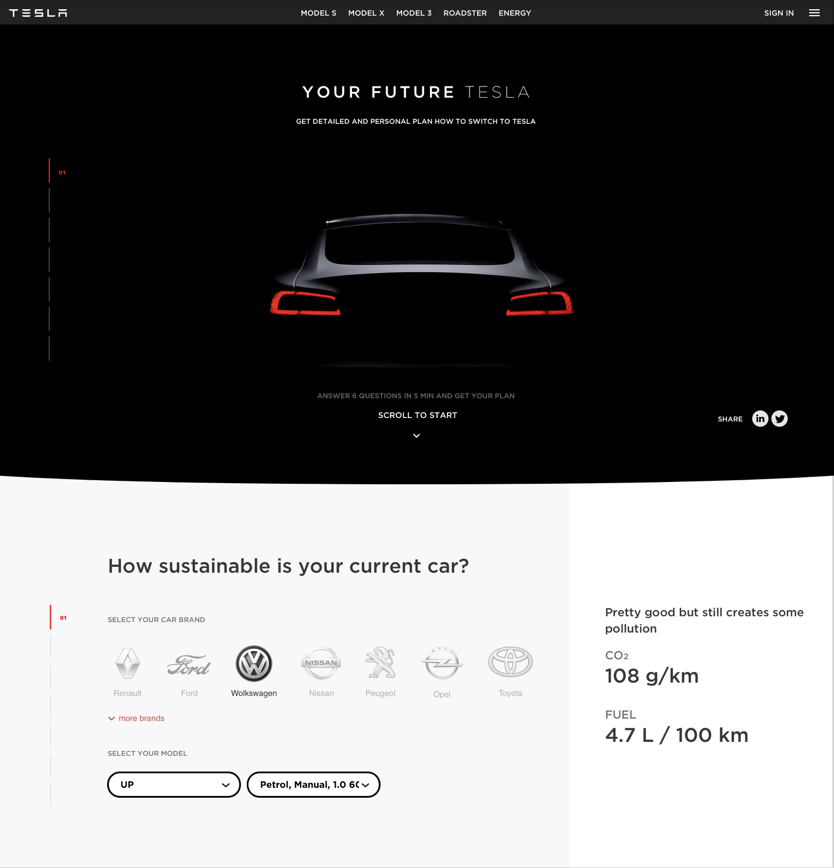
Initial screen
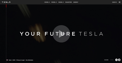
Potential issues
- The video might be a blocker for some users (mobile, for instance).
- Hard to get the person at the right moment ("I will watch it later with headphones", etc.)
- No way to skip it right away (however a user is able to skip it when the video starts).
The video might engage some users but considering that they would need to complete questionnaire afterward they might quickly lose this inspiration if they don't see the clear reasoning behind the effort they put.
Starting screen
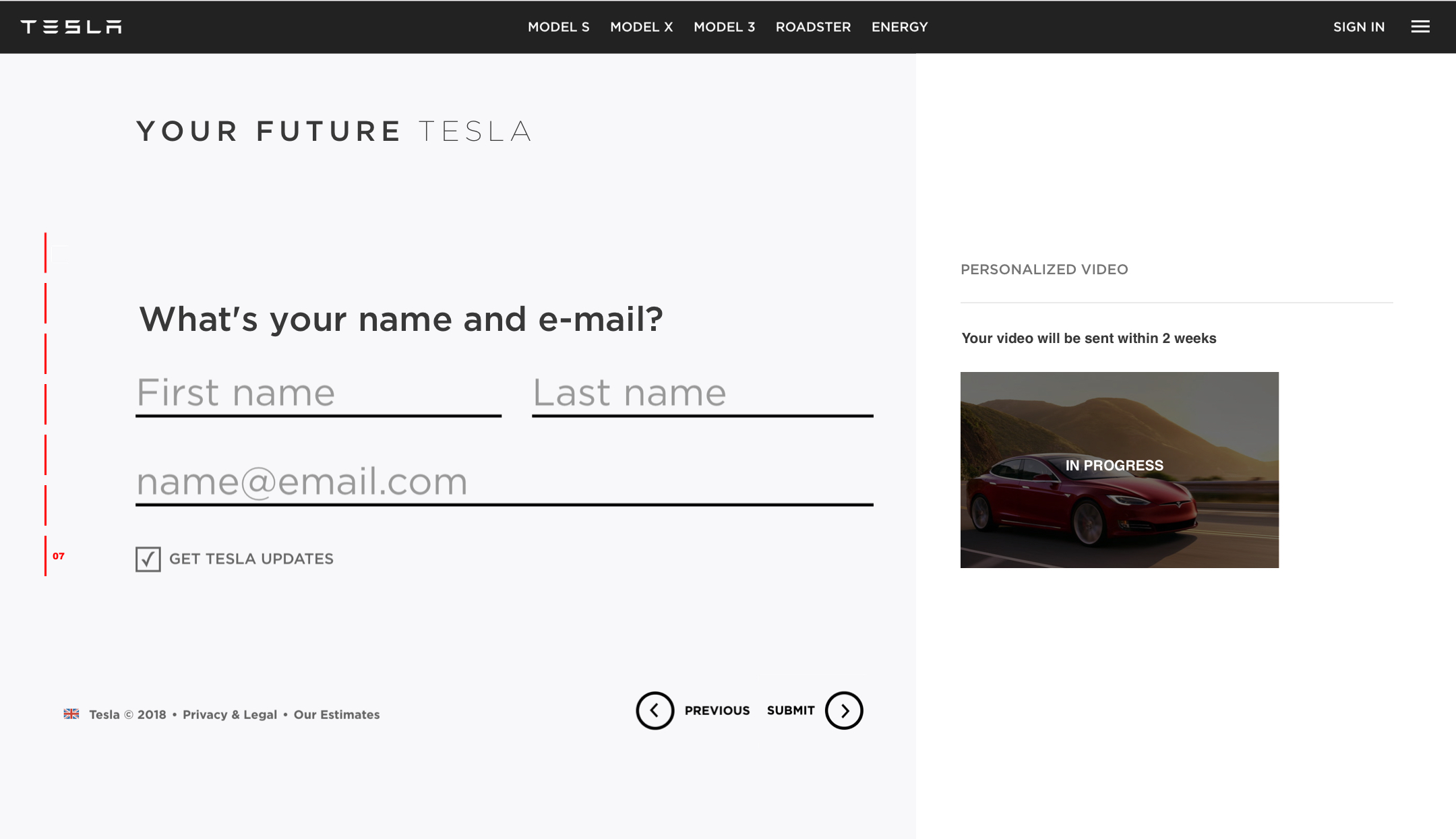
The user will get a personalized video. But not clear when and what about it would be. People might create false expectations about the personalized video and it may lead to misunderstanding. Even if the video is absolutely great and will change people's minds it’s still the case.
Potential issues
- Users might create false expectations and misunderstand the concept.
- No specific reason for users to start answering the questions now.
- What time will it take from me? (5 mins, 20 mins).
- When will I get the video? (Right after I complete questions, in a week?)
Every extra effort from a user will lead to losing potential customers. Every uncertainty in most cases will lead to misunderstanding and false assumptions which is also negative for customers and business.
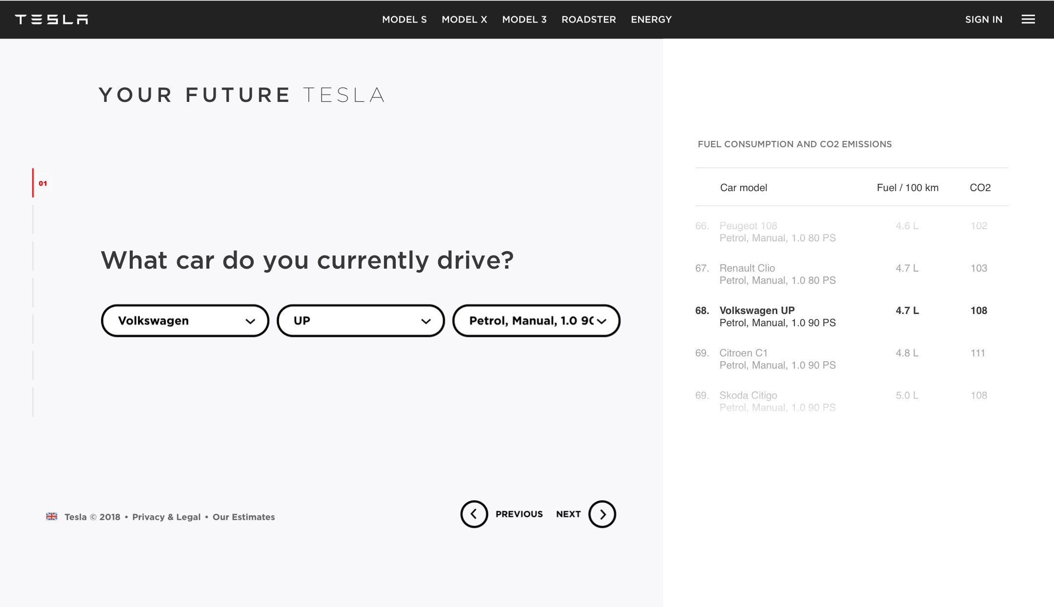
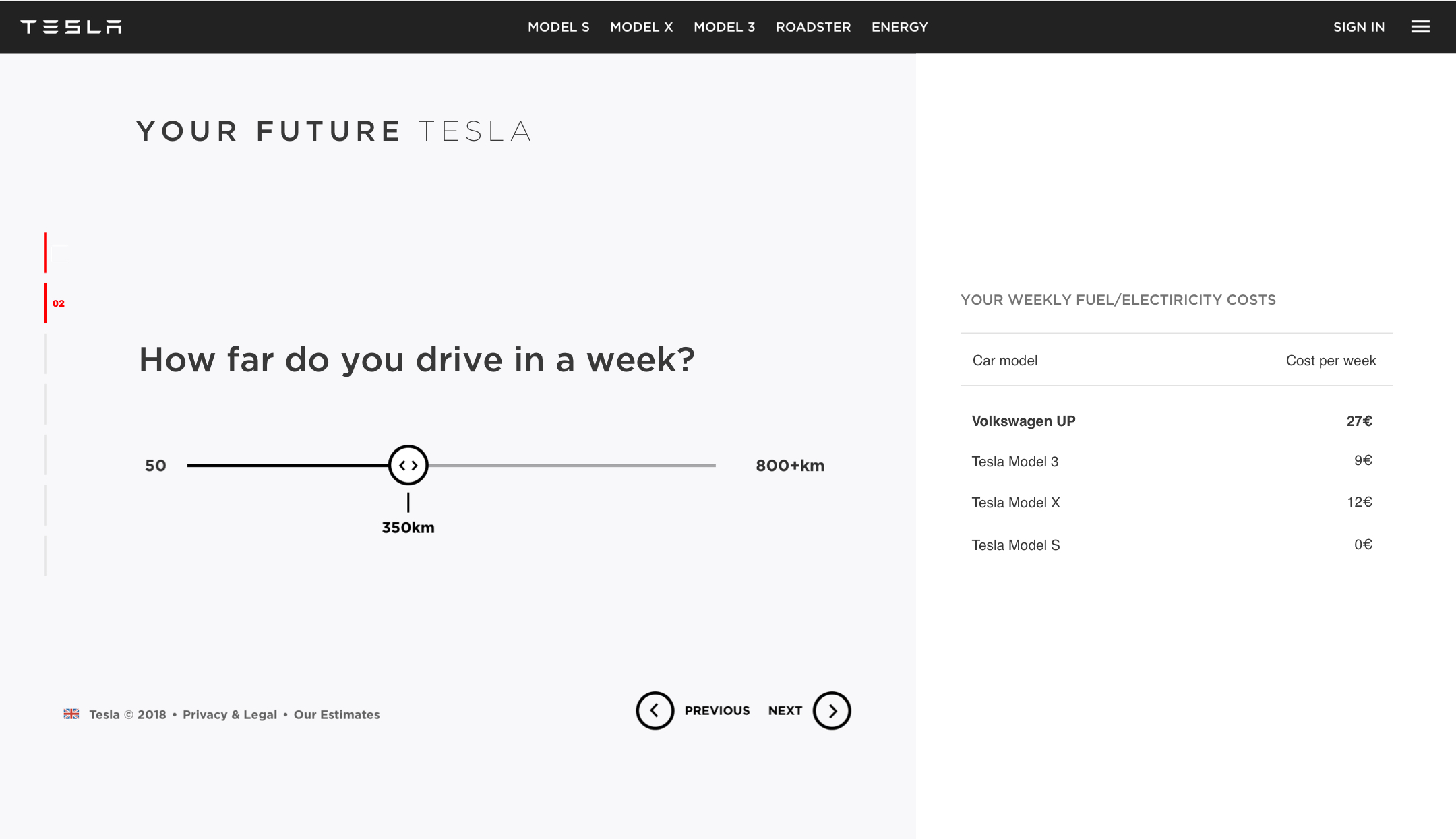
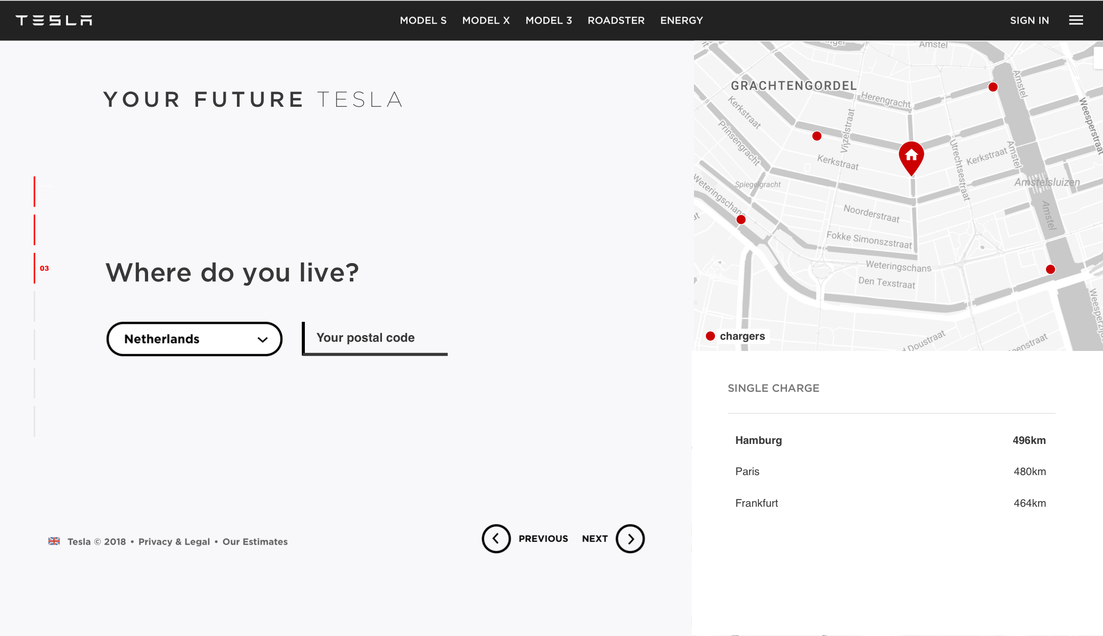
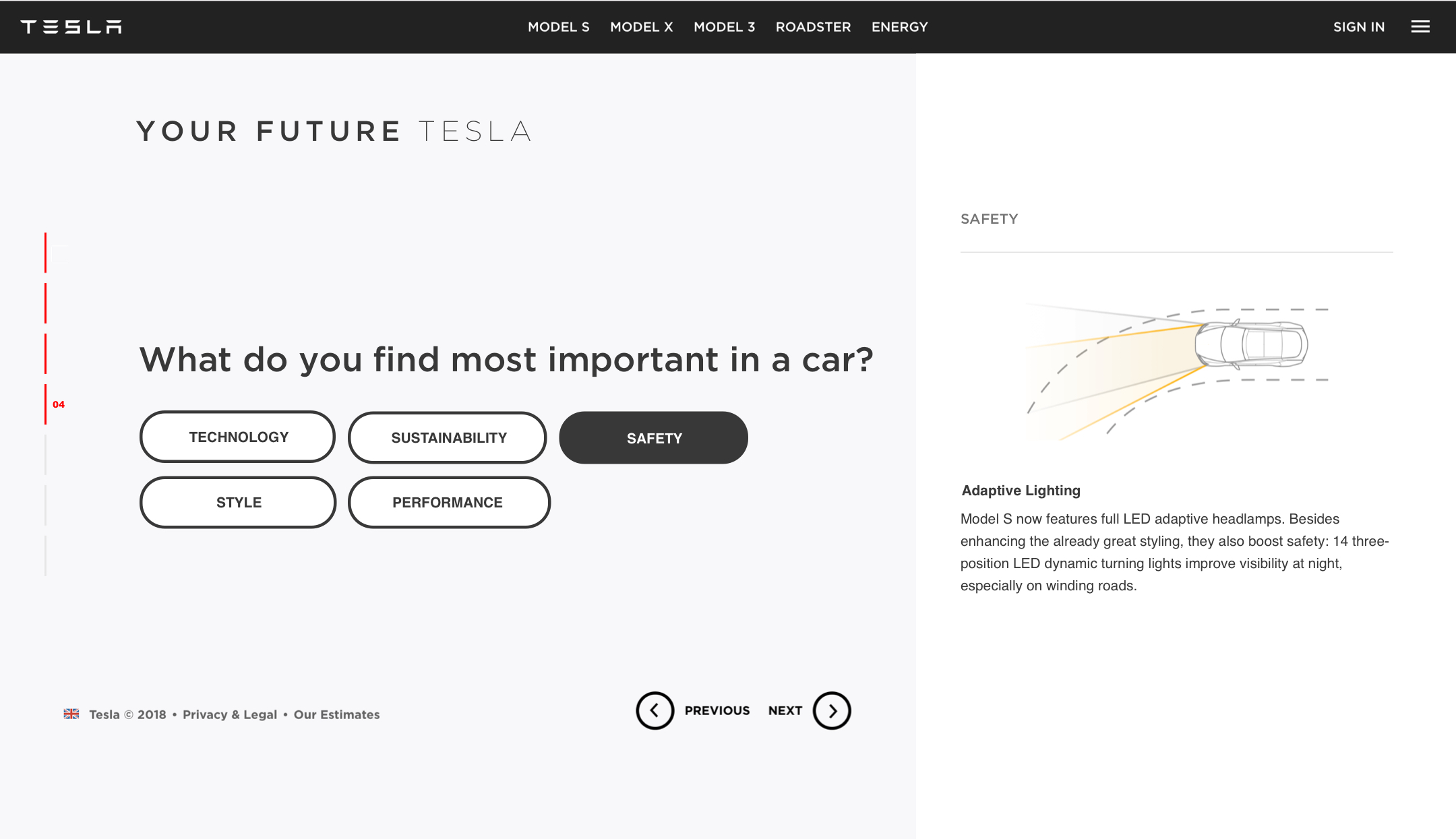
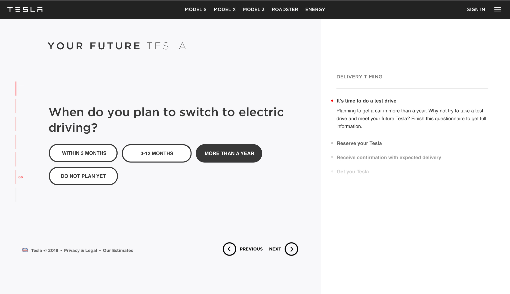
Questions
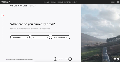
All questions seem clear and all screens communicate clearly why would you need this information. However, all questions sound direct and don't reward the user for the answers. It might lead to losing potential customers.
Potential issues
- A user might lose interest during these 6 steps, there is no 'reward' for answering each of these questions. Yes, a user will get the personalized video but it's not clear when and how useful it will be.
- The solution is focused only on people with a car.