Helping customers
to choose the right
toothbrush


01 INTRO
In this design case, I explore the problem of selecting the toothbrush in the context of the product page on Philips website.
The goal of this work is to engage the user with available options and help find the right one.
My role for this project: leading the change, research coordination, UX & UI design, AB test setup, results interpretation.
02 ROOT CAUSE
Philips electric toothbrushes
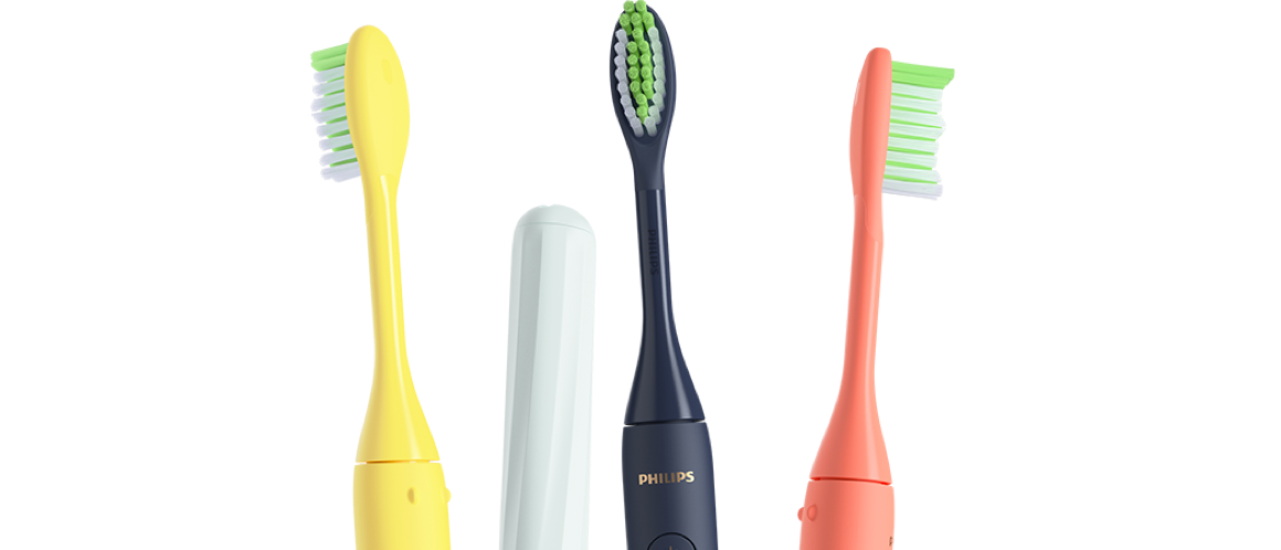
Every other year Philips introduces new series of toothbrushes. And new series usually come in multiple colors and configurations to match the search criteria for multiple groups of users.
It resulted in a huge amount of available options for people to choose from.
29

United Kingdom

34

Germany

43

France

56

Netherlands

These are the numbers of electric toothbrushes including color variations. Basically, it's available options for customers to buy directly on Philips website.
September 2021
03 INITIAL POINT
According to research
7 out of 10 customers visiting Philips website find it difficult to pick up the right toothbrush and are overwhelmed with the choice.
Moreover, most customers can't really tell what are the differences between certain models that Philips sells.
04 PROBLEM
Overchoice
Having too many approximately equally good options is mentally draining because each option must be weighed against alternatives to select the best one.
Initially more choices lead to more satisfaction, but as the number of choices increases it then peaks and people tend to feel more pressure, confusion, and potentially dissatisfaction with their choice.
05 TEAM
Meet the team
I am part of the team that leads the change across the entire Philips website. In most cases, either I or the product owner initiate the story.
My team

Myself

UX Designer

Product Owner

Analyst

FE Developer

BE Developer

Copywriter

External stakeholders

Portfolio managers

Merchnadizing specialsits

Pricing specialists

06 CHALLENGES
Challenges
Making a change on Philips website is not easy, every market works its own way.
Localization

Every market has its own portfolio of toothbrushes so there should be a scalable solution.

Stock availability

When focusing on cross-selling we should make sure that we support journeys for products that are out of stock.

Technical limitations

Almost no system to make logical connections between products.

07 PRODUCT
Electric toothbrush
Let's have a look at what makes the electric toothbrush evolve.
Brush head
Handle
Modes & functions
Accessories
Charger
Brush head, handle, Modes & functions, Accessories, Charger, Color variation and price.
08 USER
User priorities
20 users were asked to prioritize the aspects that play a leading role when choosing an electric toothbrush. The results showed the following.
Functionality
1
Color
2


Heads types
3
Price
4
Battery life, Accessories, Number of brushing heads, Brand, Chargers
09 ANALYTICS
Data check
Multiple points were checked from the data perspective.
3/4
Almost 3 out of 4 users come on mobile devices.
30%+
High bounce rate on product pages.


60%
For most users, the product page is an entry point on Philips website.
10%
Only 10% scroll to the point of the page where they can see alternative options (far below).
10 METRICS
Performance indicators
In order to understand how to measure success, I defined the metrics.
Orders
We believe that the change will engage users to buy more.
Adoption
We believe that new functionality will be used by a high number of customers (at least 15%).


Bounce
We believe that with the change fewer users will bounce.
11 CLUSTERING
Buckets
1. Collect all available options
2. Group them by series based on available configurations
3. Make logical clustering based on price, features and color
12 CLUSTERING
Groups


Basic
The basic group provides the simplest configuration for the user. It's for people that just need a toothbrush.
Advanced
The advanced choice is for people that want to get specific functions. For example, teeth whitening or pressure sensors.


Premium
The premium pack is the most advanced choice within the series. Usually, it comes with accessories and extended brush heads.
Duo
Last but not least is the option of a duo pack for people that want to upgrade partners as well.
13 DESIGN
UI design
In the first iteration of the test, we wanted to validate the hypothesis that providing alternative options on the product page would lead to more engagement of the customer and therefore customers would buy more.
It's been decided to go with the selector mainly because it provides a direct overview of available options without the need to do extra interaction from the user (larger exposure to the feature).
14 TEST
AB test results
The AB test has been set in 4 markets within Europe.
20%
Users interact with the configurator. 1 out of 4 customers that used it added the product to the cart.
5x
5 times grew engagement with color selector. More than half of customers that picked a color added a product to the basket.


+15%
Mobile orders conversion.
+7%
Desktop orders conversion.
The average order value slightly increased in the variant of the test. We've also seen bounce rate decrease.
15 LEARN
Learnings
By providing alternative options or the ability to upgrade or downgrade the choice leads to higher engagement of the customer and as result more sales.
By making it clear what makes the difference and highlighting the main benefit for users leads to higher engagement, and as a result, more sales.
16 ITERATE
Iteration 2
Despite great results we've heard (and also have seen on recordings) that people experience difficuties with selector.
Single screen overview, user should be able to use selector without need to move vertically
Combined picture of the product with selector
Quick navigation between options
Colors selector is next to the picture
Potential disandantage: no overview of available options
17 NEXT
Next steps
Reducing the portfolio size and applying a customer-driven approach for the product range communication.
Scaling to more categories (shavers, vacuum cleaners, etc.)